Cross-posted from the VOR: the Maelstrom 2.0 forums. I don't know why some of the text is highlighted a whitish-grey. I've tried to fix it a million times, and it seems that every time I hit "publish post" some new line of text is highlighted. Really sorry for the inconvenience. If I figure something out I'll implement it.
"Oh. Kay.
I did some painting this week on a test figure, which is a Union sergeant. Before I paint an army, or embark on a project of that magnitude, I find that it helps if I work on a figure to completion to see if the colors work well together or if there's any pitfalls to painting those figures. So far, I've not had to do any major re-calibrations of paint schemes in my time, but a test figure helps me work out any kinks along the way.
Some minor details may change, but here's the test figure. The only things not finished on him is the base (I'm gonna put some static grass on him), and the green fatigues are only base-coated. The reason for this is that I used the P3 paint Ordic Olive and I don't actually own any of the recommended highlight colors (Moldy Ochre, and Sulfuric Yellow). This should be remedied by next Wednesday, but in the mean time I think I'll just go ahead and finish it tomorrow with what I have on hand (I think with a total of five different paint lines, I'm sure I'll find something to substitute). With some more work I might even enter this into the paint competition on the forums here.
The paint scheme is taken as best I could from the Matt Wilson cover art of the Union forcebook. I'm a big fan not only of Matt Wilson, but of that piece of art as well.

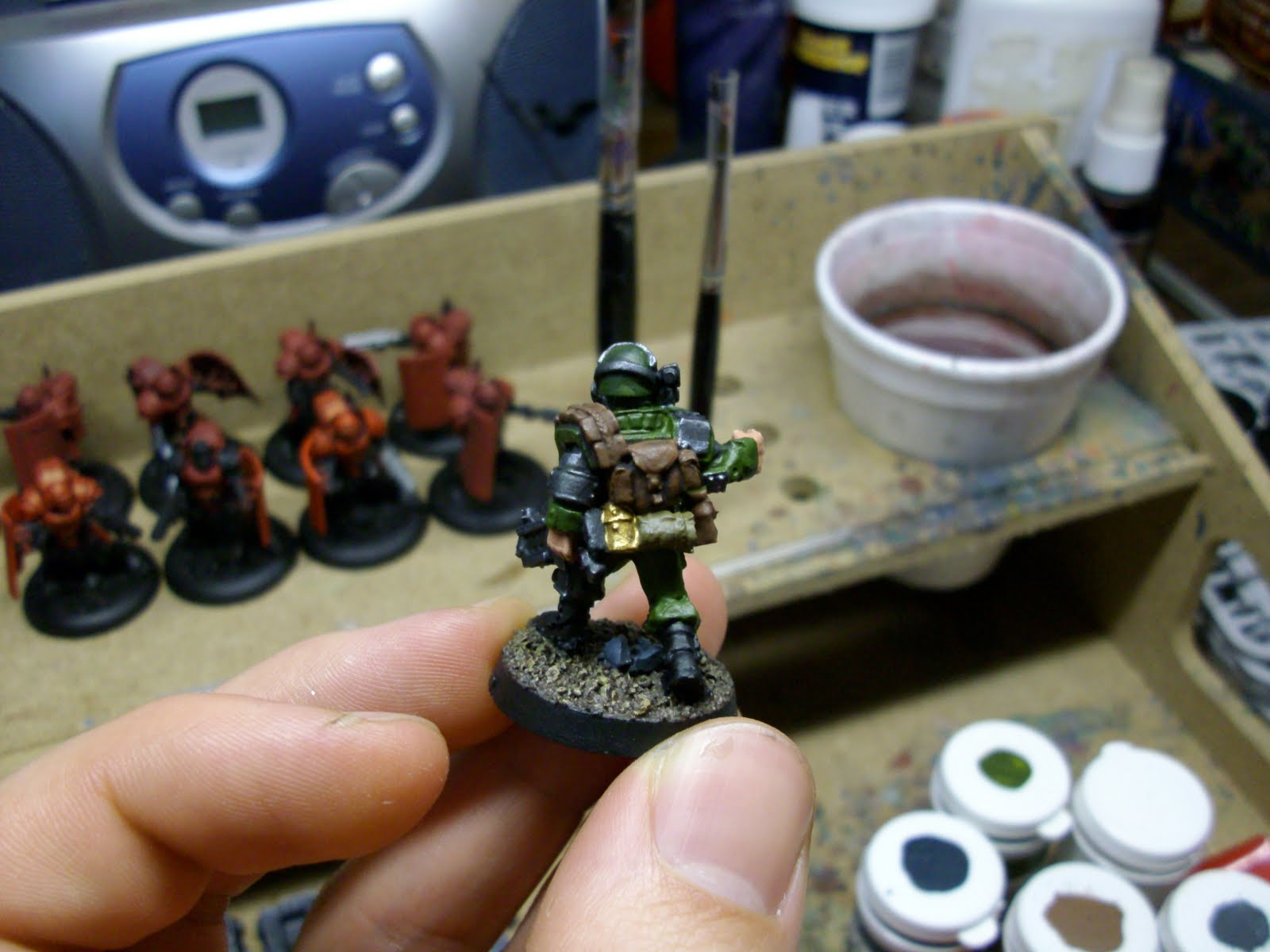
Before I get to the breakdown, know that when I highlight I generally mix in the highlighted color into the previous color or color mixture. For example when I highlight a dark red, I'll mix in a medium red; paint it on, then mix in a light red into that mixture, then paint that on as the final highlight. I tend not to just paint a lighter color over top.
+The fatigues are Ordic Olive (P3).
+The metallics are Shadowed Steel (Reaper Master Series (RMS)), followed by a wash of Badab Black (Citadel). I'm actually gonna do some highlights later with Honed Steel(RMS), then perhaps Polished Silver (RMS) if it's not too bright.
+The blacks are Thamar Black (P3), then some Coal Black (P3) mixed in for a highlight, then finally some Menoth White Base (P3) mixed in for the final highlight.
+The browns are Bootstrap Leather (P3) with a Devlan Mud (Citadel) wash. This might become a Calthan Brown (Citadel) with a Dheneb Stone (Citadel) highlight, then a Devlan Mud (Citadel) wash.
+The little bedroll on his back was just Thornwood Green (P3). I'll probably just highlight it later. I don't imagine I'll wash it. It might end up too dark.
+His skin was Idrian Flesh (P3), then Khardic Flesh (P3), then Midlund Flesh (P3), then finally Ryn Flesh (P3). Doing faces and skin is my favorite part of a figure, and it's something I think I'm pretty good at. I've tried washing skin and haven't found a wash or an ink that I like for flesh. They often end up just darkening it more than I'd like. The fact that I start with something dark like Idrian Flesh and then paint right over top of it with the base skin color I want (like Khardic Flesh) gives it that definition without darkening the whole thing.
+Finally the base is (aptly enough) Battlefield Brown (P3) with a Gun Corps Brown (P3) highlight drybrushed right over top (no mixing), and finally a Rucksack Tan (P3) done with the same method as the last highlight. The rocks are Greatcoat Grey (P3) with a Morrow White (P3) highlight that had some of the base color mixed into it. Green static grass will get added when the model's 100% done.
+I've gotten into the habit of painting the rims of my bases black (Thamar Black (P3)). My boss isn't that keen on it, but I like the way it looks. It makes the figure look less like he's on a mound of dirt/grass/rubble/etc. and more like the base is just there because he can't realistically stand on the tabletop. It's hard to explain my aesthetic rationale behind it. Hopefully you understand.
Sorry for the crummy photography. I have a cheap-o camera that doesn't do macro very well at all. These two are the best of 20 photos. Seriously. Hopefully you get the drift. I had tons of fun painting this fig, and can't wait to get to the rest of the army (when it arrives from IWM)."
+++END TRANSMISSION+++
1 comment:
I had the same problem with the highlight thing mate.
Go into 'Edit Post'. Select your post, then click the 'compose' tab at the top right, (above your text). There's a highlighter option there, which you can fool around with. The other alternative is that your blogger spellcheck is on. Again, try the compose tab.
Keep up the great work. I hope to see more of your Vor stuff!
Post a Comment